If your website were a student, Google’s mobile-first indexing would be the headteacher constantly checking its homework on a smartphone. In today’s digital landscape, if your site isn’t optimized for mobile, you’re basically showing up to class without a pen. Let’s make sure your site passes Google’s test with flying colors.
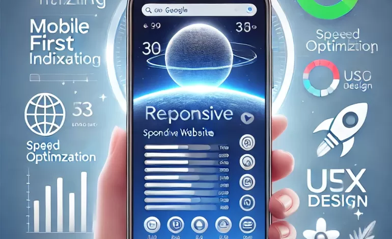
What is Mobile-First Indexing (And Why Should You Care)?
Mobile-first indexing means Google primarily uses the mobile version of your site for ranking and indexing. In other words, Google checks how well your site performs on a phone first – not a desktop.
If your mobile site is a shrunken, unclickable mess, you might as well wave goodbye to good search rankings.
Pro Tip: If your site works perfectly on desktop but looks like a Picasso painting on mobile, it’s time to make changes.
Mobile = Majority of Traffic – Catch Up!
Over 60% of all web traffic now comes from mobile devices. If you’re ignoring mobile optimization, you’re essentially turning away most of your audience.
What Can You Do?
- Ensure your site design is responsive.
- Check mobile usability in Google Search Console.
- Test your site regularly on different devices.
Pro Tip: Borrow your friend’s phone, your mom’s tablet, and even that ancient iPhone 6 – test your site everywhere.
Page Speed: Mobile Users Don’t Have Time
Mobile users are on the go – literally. If your site doesn’t load within 3 seconds, expect visitors to bounce faster than a dropped ice cream cone.
What Can You Do?
- Minimize CSS and JavaScript.
- Enable lazy loading for images.
- Use lightweight themes and plugins.
Pro Tip: A fast site is like a fast-food drive-thru – quick, easy, and no frustration.
UX for Fingers, Not Cursors
Forget the mouse – it’s all about fingers now. If users have to pinch and zoom to read your site, you’ve already lost them.
Fix It Now:
- Use large, legible fonts.
- Space out links and buttons.
- Keep forms simple and mobile-friendly.
Pro Tip: Pretend your thumbs are the size of sausages – if you can’t click it, it’s too small.
Don’t Block Important Content (Google Hates It)
Avoid pop-ups that cover the whole screen or media that won’t load on mobile. Google frowns on anything that slows down user experience.
What You Should Do:
- Keep pop-ups minimal.
- Use mobile-friendly formats.
- Prioritize above-the-fold content.
Pro Tip: If your site is giving users “close-the-tab” energy, rethink the design.
Test, Optimize, Repeat
Mobile-first isn’t a one-and-done deal. Regular testing and optimization are key to keeping your site on top.
Action Steps:
- Run regular audits with tools like Google’s Lighthouse.
- Update old content to ensure it’s mobile-optimized.
- Continuously check for broken links or images.
Pro Tip: Google changes the rules often – stay ahead by making testing part of your routine.
Mobile-first indexing isn’t just a trend – it’s Google’s reality. By prioritizing your mobile site, you’re ensuring that your site ranks higher, loads faster, and keeps users happy.
Is your site still living in the desktop era? Let SEOCTRL bring it into the mobile age!
📱 Visit seoctrl.com and let us future-proof your website with mobile-first optimization.